What Does ‘Warm Undertone’ Even Mean? A Plain-English Guide to Color Words
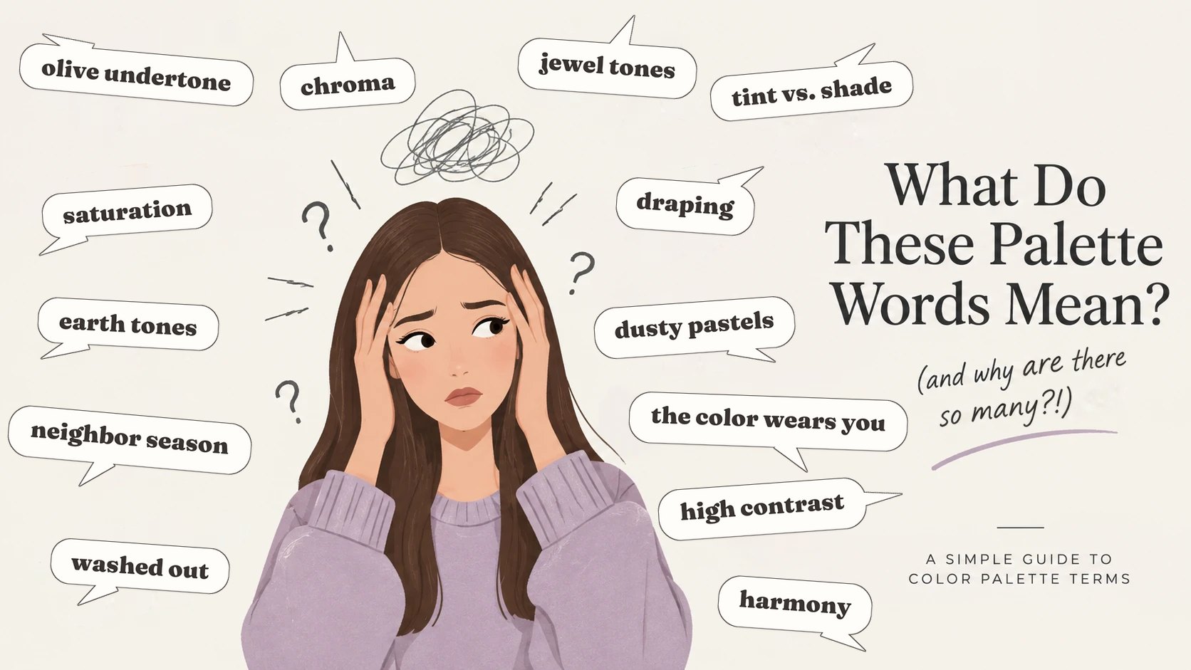
It all comes down to three questions
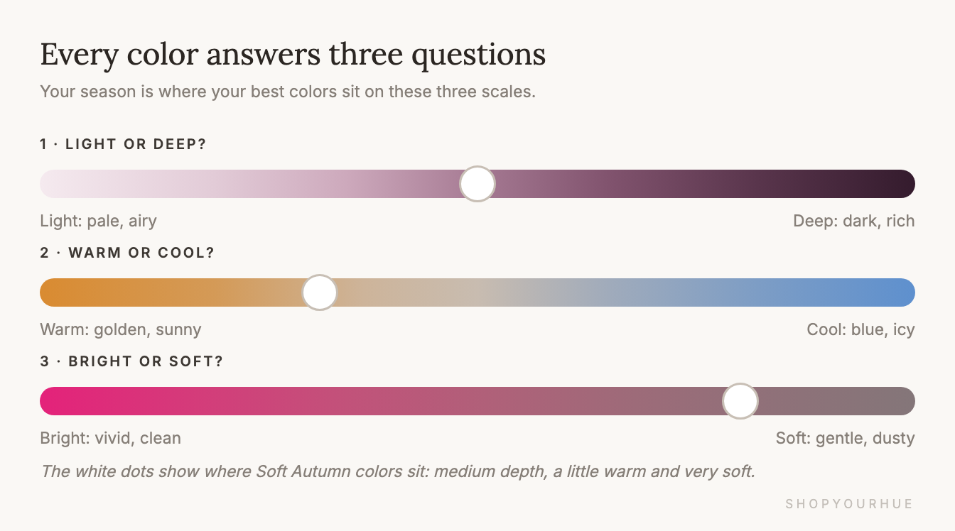
Almost every word in color analysis comes back to three simple questions about a color.
- Is it light or deep?
- Is it warm or cool?
- Is it bright or soft?
Once you know the answers to these three questions, you understand most of color analysis.
Color analysis videos can be hard to follow, because people use phrases like “too high-chroma for her undertone” without explaining them. Your season is really just the answers to those three questions, worked out for your face. A Soft Autumn, for example, looks best in colors that are soft and a little warm.
Below, I go through every word you're likely to come across, one at a time, with a picture for each. You can use the index to jump to the word that's confusing you, or read from the top. By the end, a description like “cool-toned with medium contrast” should make complete sense.
Index
This is every word in this guide, in the order it shows up. Tap one to jump to it.
| Word | What it means |
|---|---|
| Light vs. deep | How pale or deep a color is. You'll also see the words value or depth. |
| Warm vs. cool | Whether a color leans golden or blue. Some people call this temperature. |
| Bright vs. soft | How vivid a color is. You'll also see the words chroma and saturation. |
| Undertone | The warm or cool hint under your skin. It stays the same when you tan. |
| Neutral and olive | Undertones that sit in the middle, or have a touch of green. |
| The jewelry test | Holding gold and silver by your face to see which looks better. |
| Contrast | How different your hair, skin and eyes are from each other. |
| Hue | The basic name of a color, like red or blue. |
| Tint, tone and shade | A color with white, gray or black mixed in. |
| Pastels, jewel tones, earth tones, muted, neon | Words stores use for groups of colors. |
| Neutrals | Basics like black, white, navy and camel. They lean warm or cool too. |
| Color analysis and draping | Finding the colors that look best on your face, usually with fabric held under your chin. |
| Palette | All the colors that suit you. |
| Season | One of four big color groups: Spring, Summer, Autumn or Winter. |
| The 12 seasons | Each season split into three. The first word tells you what matters most. |
| Neighbor seasons | Seasons that sit next to each other and have something in common. |
| Harmony | When a color makes you look fresh and awake. |
| Washed out | When a color makes you look pale or tired. |
| The color wears you | When people notice the outfit instead of you. |
The three big questions
Once you understand these three, the rest of this guide is easy.
Light vs. deep
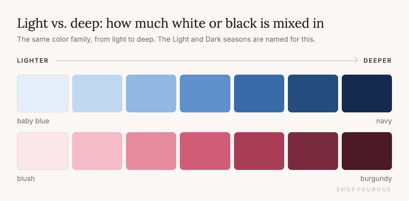
Light vs. deep is the easiest of the three, because it only means how pale or how deep a color is. Baby blue and navy are both blue, but one is light and the other is deep. You might also see this called “value” or “depth.”
If a season has “Light” in its name, it looks best in the paler versions of its colors, and if it has “Deep” in its name (some people say “Dark”), it looks best in the deeper ones.
A quick way to check is to picture the color in a black-and-white photo. Light colors turn pale gray, and deep colors turn almost black.
Warm vs. cool
Warm colors lean toward yellow and gold, like a ripe peach. Cool colors lean toward blue, like blueberries or snow in the shade. You'll sometimes hear this called a color's “temperature.”
Most people get stuck on the fact that reds aren't automatically warm and blues aren't automatically cool, because almost every color comes in both versions.
Tomato red is warm, and raspberry red is cool. Green works the same way, with olive on the warm side and emerald on the cool side. Even white comes in both versions, since creamy ivory is warm and crisp paper white is cool.
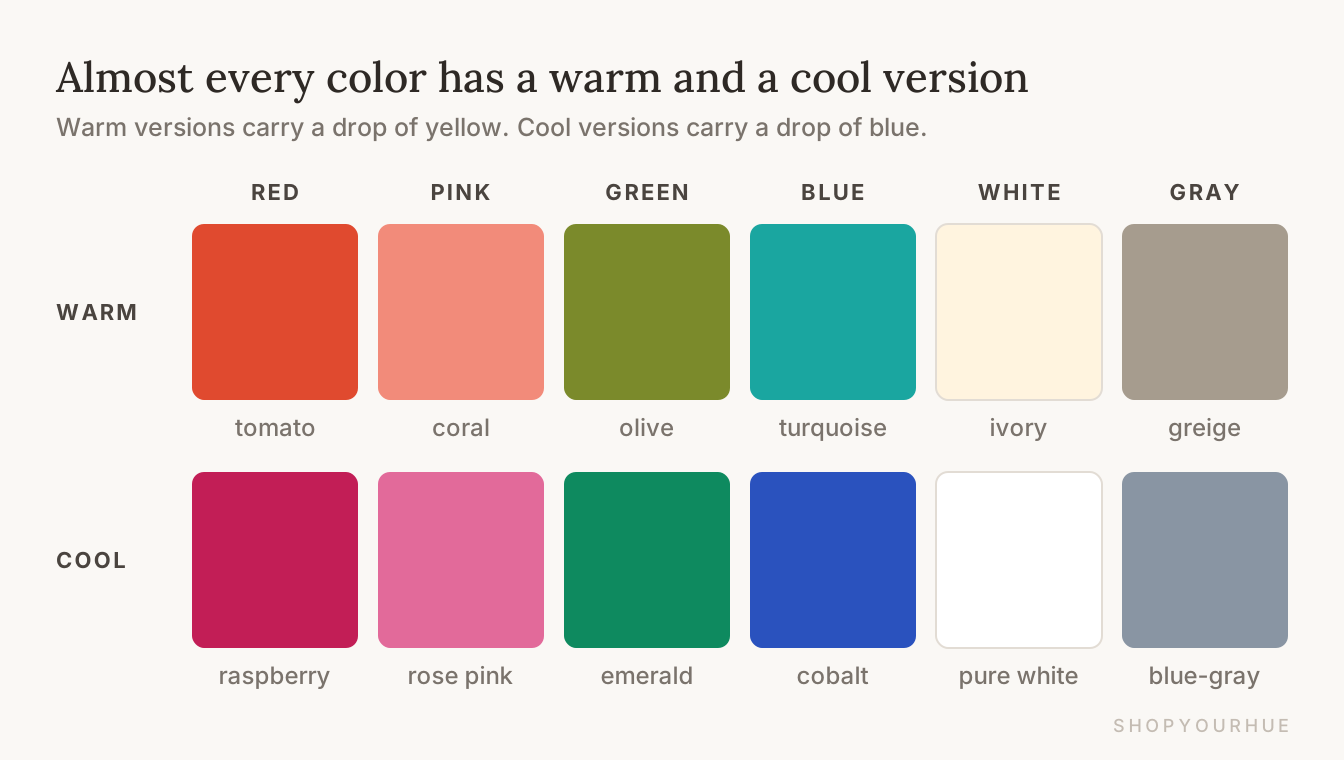
The easiest way to tell them apart is to put two versions side by side. The warm one looks like a drop of yellow was stirred into it, and the cool one looks like a drop of blue was stirred in.
Bright vs. soft
Bright vs. soft is the question that confuses people the most, because “bright” sounds like it should mean light. In color analysis, a bright color is vivid and clean, like a highlighter, a traffic light or a fresh lime.
A soft color has a little gray mixed in, so it looks slightly faded. Dusty rose and sage green are soft colors, and so are your favorite faded jeans.
You'll also hear people say “muted,” or use the words “chroma” and “saturation,” and they all mean the same idea.
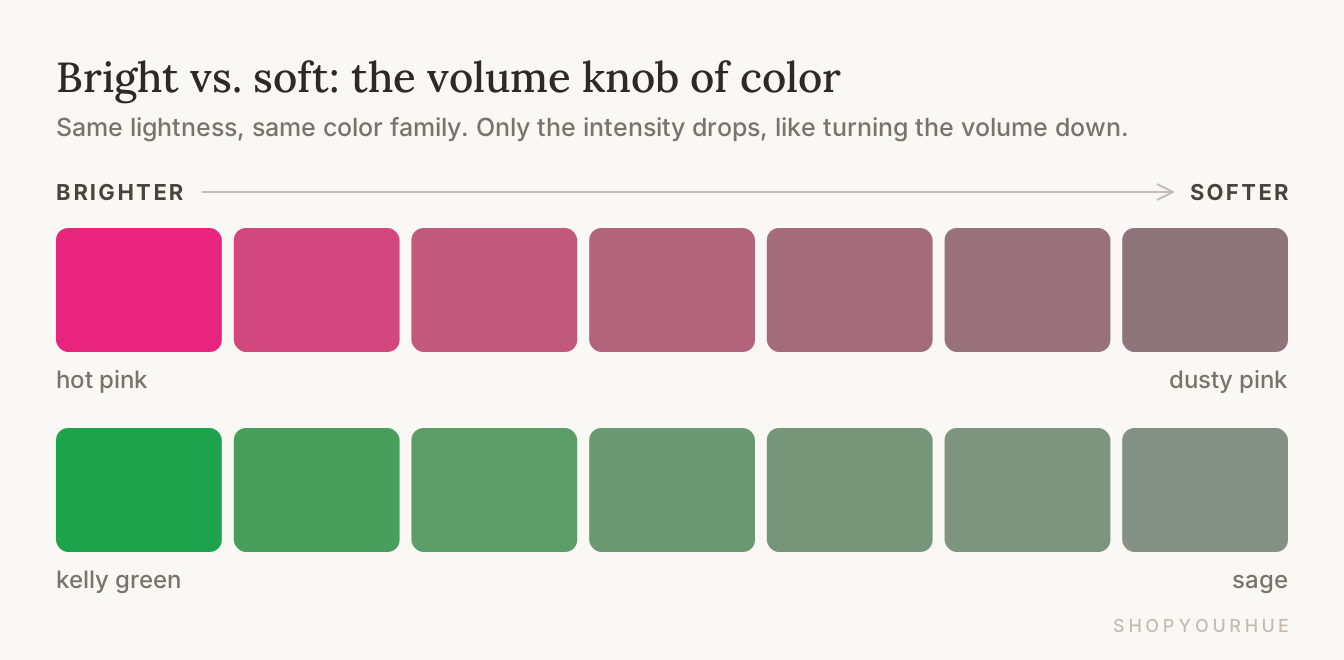
This is why a navy can be bright, if it's crisp and inky, and a pale pink can be soft, if it's dusty and grayish. How light a color is and how bright it is are two different things, and your season depends on both.
Words about you
The next group of words describes you, not the clothes. When a color analyst talks about your “coloring,” they mean your skin, hair and eyes all together.
Undertone
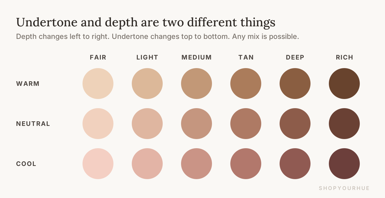
Your skin color really has two parts. The first is the skin tone everyone notices, which can be fair, medium, deep or anywhere in between, and it changes a little when you tan.
The second part is the undertone, which is a faint warm or cool hint underneath. It stays the same whether you're pale in February or tan in August. A warm undertone looks a little golden or peachy, and a cool undertone looks a little pink or rosy.
Many people think undertone depends on how light or deep your skin is, but it doesn't. Very fair skin can be warm, and very deep skin can be cool.
Neutral and olive
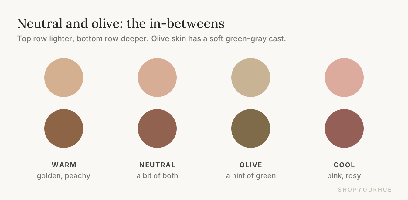
Some people don't clearly lean either way, and that's called a neutral undertone. If gold and silver both look fine on you, and so do camel and gray, you might be neutral.
Olive skin is different from all of these. It has a soft greenish or grayish hint, so neither “golden” nor “rosy” really describes it. This makes olive one of the hardest undertones to figure out, and it's normal to have gotten mixed answers before.
The jewelry test (and the vein test)
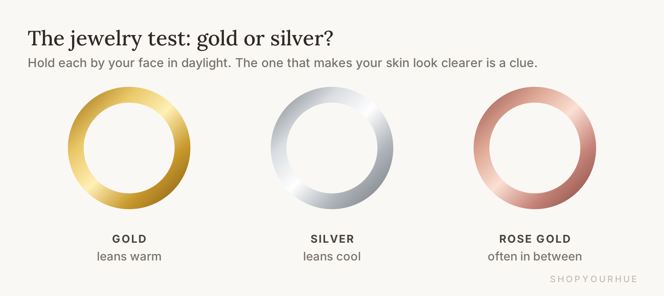
The easiest clue you can check at home is jewelry. Stand near a window during the day with no makeup on, and hold something gold near your face, then something silver.
Look at your skin, not the jewelry. If gold makes your skin look smoother and brighter, you probably lean warm, and if silver does, you probably lean cool. If rose gold looks best of all, you might be somewhere in between.
You might also hear about the vein test, where green veins on your wrist mean warm and blue or purple veins mean cool. It's popular, but it isn't very reliable, because lighting changes how veins look. Both tests can give you a good hint, but neither one gives a final answer.
Contrast
Contrast is how different your hair, skin and eyes are from each other in lightness.
Imagine a black-and-white photo of your face. If there are big jumps, like black hair against very fair skin, you're high contrast. If everything is close together, like light blonde hair with fair skin and light eyes, you're low contrast.
Low contrast doesn't always mean light, though, because dark hair, deep skin and dark eyes can be low contrast too when they're all close to each other.
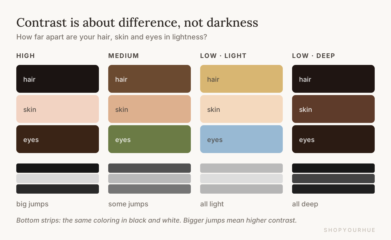
Contrast matters because outfits usually look best when they match your own contrast. If you're high contrast, bold pairings like black and white look great on you. If you're low contrast, colors that sit close together, like cream with camel, look more pulled together, and stylists call that a “tonal” outfit.
Words for the colors themselves
These words show up on product pages and color charts, and they describe the colors themselves rather than you.
Hue
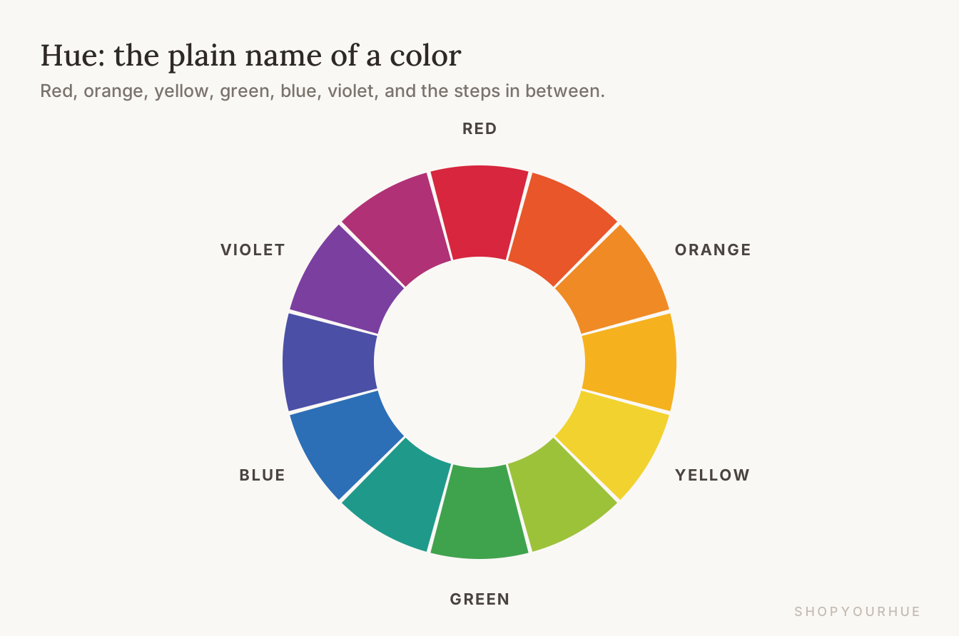
Hue is the basic name of a color. Red, orange, yellow, green, blue and purple are all hues, and so is every step in between. If two sweaters are “the same hue,” they're the same basic color, even if one is lighter or softer than the other. This is also where the name ShopYourHue comes from.
Tint, tone and shade
These three words come from painting, and they're all about what gets mixed into a color.
When you add white to a color you get a tint, so pink is a tint of red. When you add gray you get a tone, like dusty rose, and when you add black you get a shade, so burgundy is a shade of red.
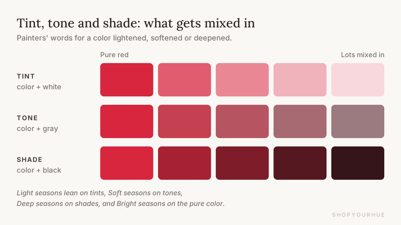
These line up with the seasons too. Light seasons wear a lot of tints, Soft seasons wear a lot of tones, and Deep seasons wear a lot of shades. Bright seasons look best in the pure color with nothing mixed in.
Pastels, jewel tones, earth tones, muted and neon
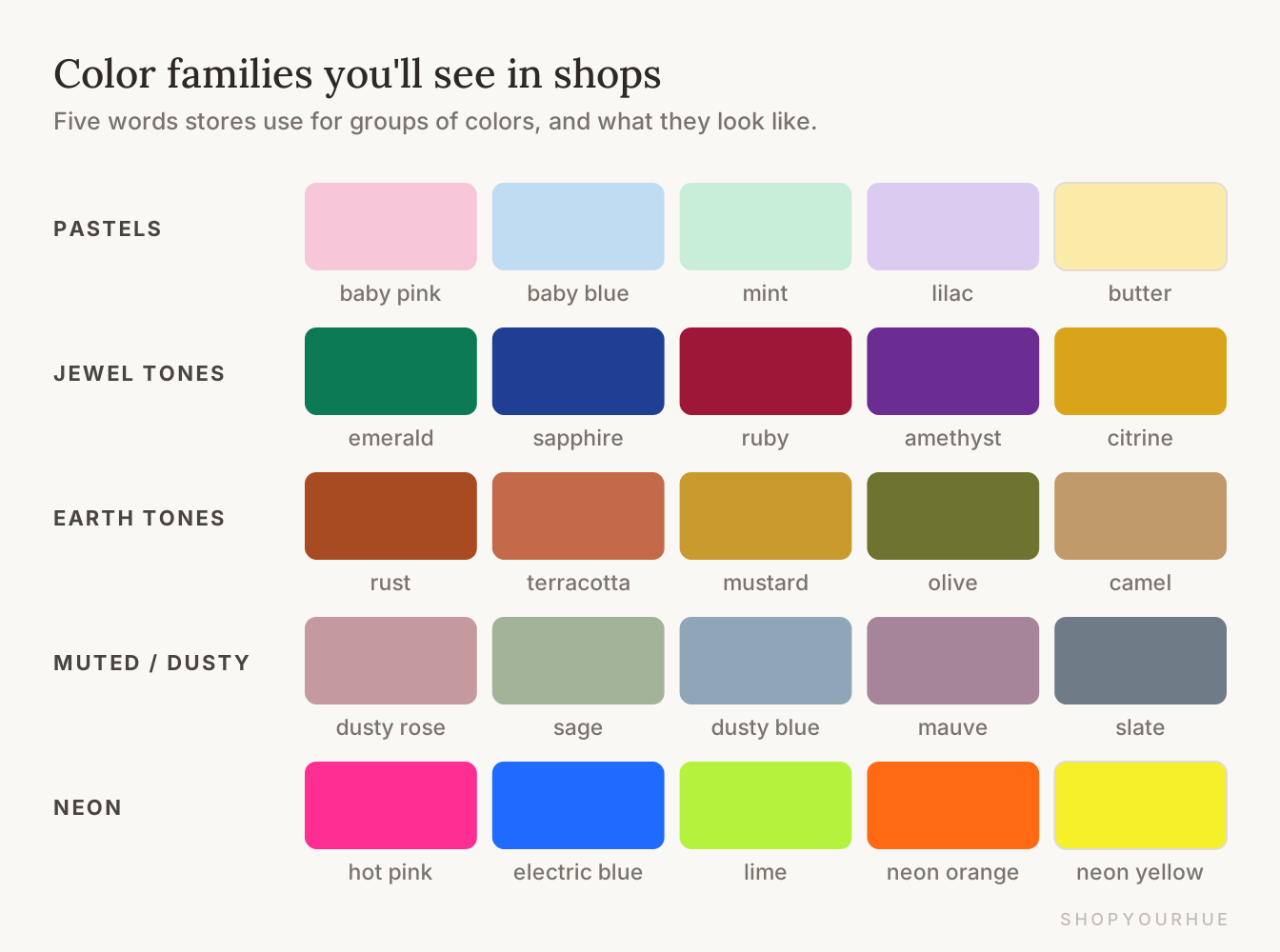
Stores use these words a lot. Each one names a group of colors, and each group tends to suit certain seasons.
Pastels are very light, gentle colors like baby pink, mint and lilac, and they suit Light Springs and Light Summers best.
Jewel tones are deep, rich colors named after gemstones, like emerald, sapphire and ruby, and Winters look amazing in them.
Earth tones are the colors of soil and leaves, like rust, olive, mustard and camel, and they belong to the Autumns.
Muted or dusty colors have some gray mixed in, like dusty rose and sage, and they suit Soft Summers and Soft Autumns.
Neon colors are the loudest of all, and usually only the Bright seasons can wear them near the face without the color taking over.
Neutrals
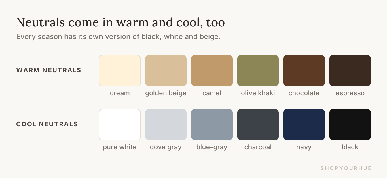
Neutrals are the basics in your closet, like black, white, gray, navy, beige, brown and camel. They're the pants, coats and plain tees that go with everything.
Most people are surprised to learn that neutrals are warm or cool too. Cream, camel and chocolate brown are warm, and pure white, gray and black are cool.
This means the black blazer you wear all the time might not be doing you any favors. For a lot of women, switching to chocolate brown or navy is one of the easiest changes they can make.
How the season system works
This part covers the bigger picture, including how a season gets figured out and how all 12 fit together.
Color analysis and draping
Color analysis means figuring out which colors look best right next to your face. It isn't about your favorite colors, which is a different question, but about the ones that make you look your best. You might also hear it called personal or seasonal color analysis.
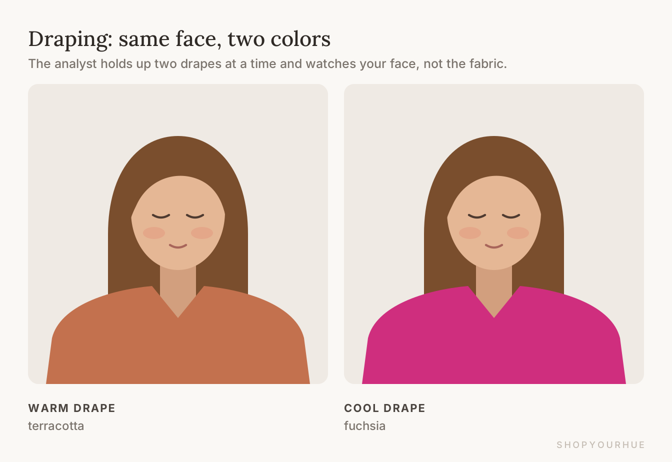
The classic way to do it is called draping. A color analyst sits you near a window during the day, with no makeup on, and holds big pieces of colored fabric under your chin, two at a time.
While they do this, the analyst is watching your face, not the fabric. They look for whether your skin looks smoother, whether the shadows under your eyes fade, and whether your eyes look clearer.
If there's no color analyst near you, the color test on ShopYourHue is a good place to start.
Palette
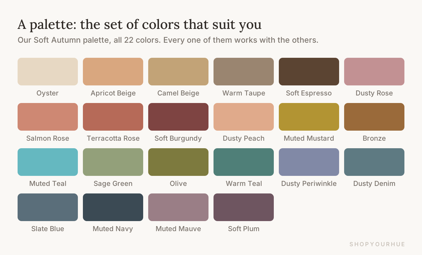
Your palette is the whole set of colors that suit you, and you might also see it called “your colors.” On ShopYourHue, each season's palette has around twenty of them.
A palette works best as a shopping list rather than a strict set of rules. Every color on it works with your coloring, and they all work with each other, which is what makes a closet built around one palette so easy to mix and match.
Season
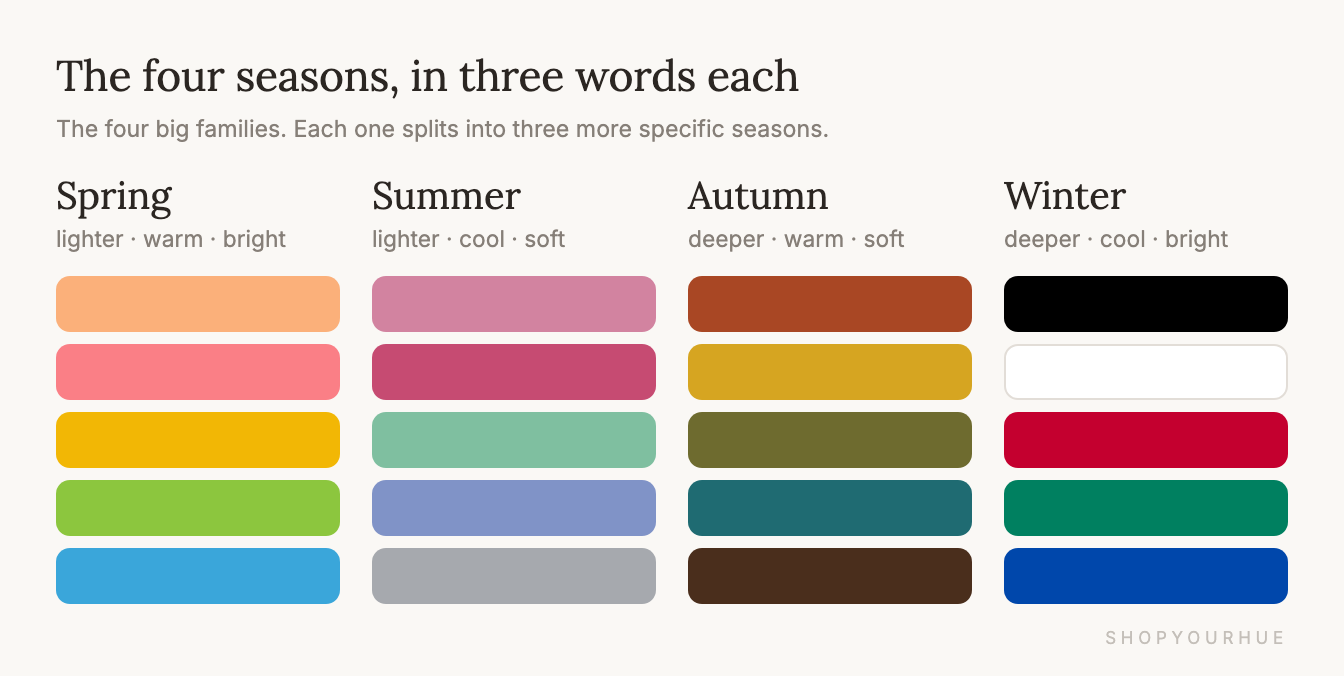
The four seasons are the four big color families, and each one is a mix of answers to the three questions from the start of this guide.
Spring is on the lighter side, warm and bright, and Summer is also on the lighter side, cool and soft. Autumn is deeper, warm and soft, and Winter is deeper, cool and bright.
The names have nothing to do with your birthday or the time of year you look best. They're an easy way to remember each family, since Spring's colors look like fresh flowers, Summer's look like a hazy beach, Autumn's look like the woods in October and Winter's look like city lights on snow.
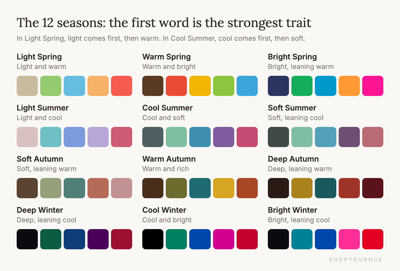
The 12 seasons
Four families turned out to be too broad, since lots of people fall somewhere in between, so each family gets split into three. That gives you 12 seasons.
The first word in each name tells you what matters most for that season. Light seasons are all about pale, airy colors, and Deep seasons (sometimes called Dark) are about rich, deep ones. Bright seasons (sometimes called Clear) are about vivid colors, and Soft seasons are about gentle ones.
Warm Spring, Cool Summer, Warm Autumn and Cool Winter are the purest version of each family, where warm or cool matters most. You'll also see them called the True seasons, such as True Autumn.
This means a Soft Autumn's colors are soft first and warm second, and a Bright Winter's are bright first and cool second.
Neighbor seasons
Picture the 12 seasons sitting in a circle, each one blending into the next. Seasons that sit side by side always have something in common, which is why so many people feel stuck between two of them. Some people call these “sister seasons.”
Where two families meet, they share their biggest trait. Light Summer and Light Spring are both light, and Bright Spring and Bright Winter are both bright. Deep Winter and Deep Autumn are both deep, and Soft Autumn and Soft Summer are both soft.
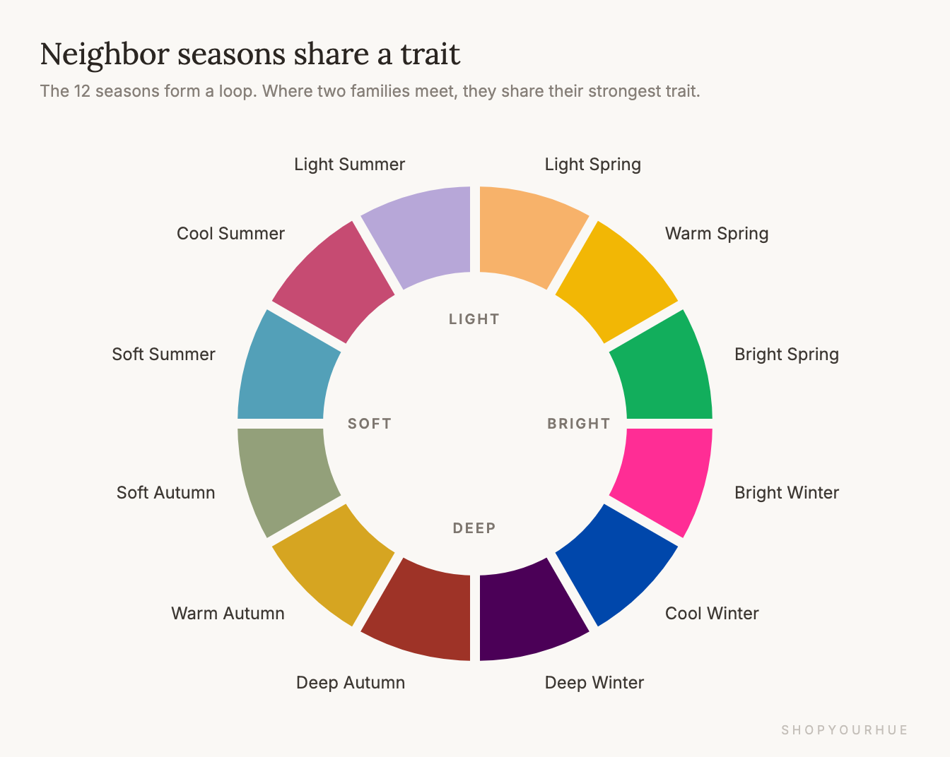
If you can't decide between two seasons, check whether they're next to each other in the circle. If they are, you're close either way, and the colors they share will work for you.
How a color looks on you
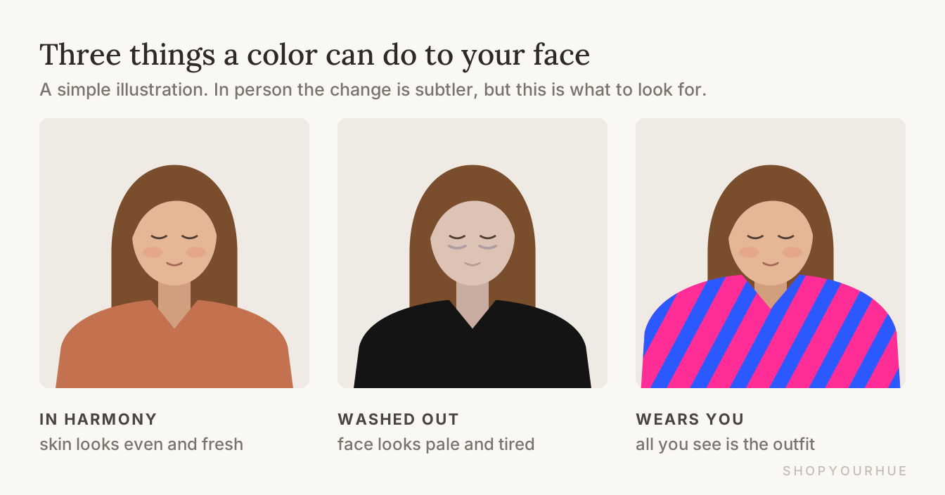
The last group of words describes what a color actually does to your face. Once you know what to look for, you'll start noticing it every time you look in the mirror.
Harmony (or “glow”)
Harmony is the goal. In the right color, your skin looks even and fresh, your eyes look brighter, and the little shadows under your eyes and around your mouth seem to fade.
You can usually tell it's happening because the compliments change, and people tell you that you look great instead of telling you that your top looks great.
Washed out
Washed out is the opposite of harmony. Your face looks paler or more tired than it really is, and dark circles and redness can stand out more.
It usually happens when a color is the wrong temperature for you, or much darker and stronger than your own coloring. A woman with light, soft coloring dressed in all black is a common example.
“The color wears you”
Sometimes a color doesn't wash you out but takes over instead, so people remember the bright print and forget about the person wearing it. This happens when a color is a lot brighter or bolder than your natural coloring.
You don't always have to give that color up, though. Wearing it lower down, like in pants, shoes or a bag, usually fixes the problem.
Now you speak color
To see how much of this you now know, read this description of a season.
Soft Autumn: warm-leaning, low to medium contrast, muted colors. Trade black for chocolate and stark white for cream.
Before reading this guide, that probably sounded like a secret code, but now you can translate it yourself. It means gentle, earthy colors, nothing too harsh, and cozy brown instead of black.
You don't have to memorize any of this. If a word ever confuses you on a season page or a product label, you can come back and look it up in the index.
The next step is to find your own palette and then shop clothes that are already matched to it.